U92
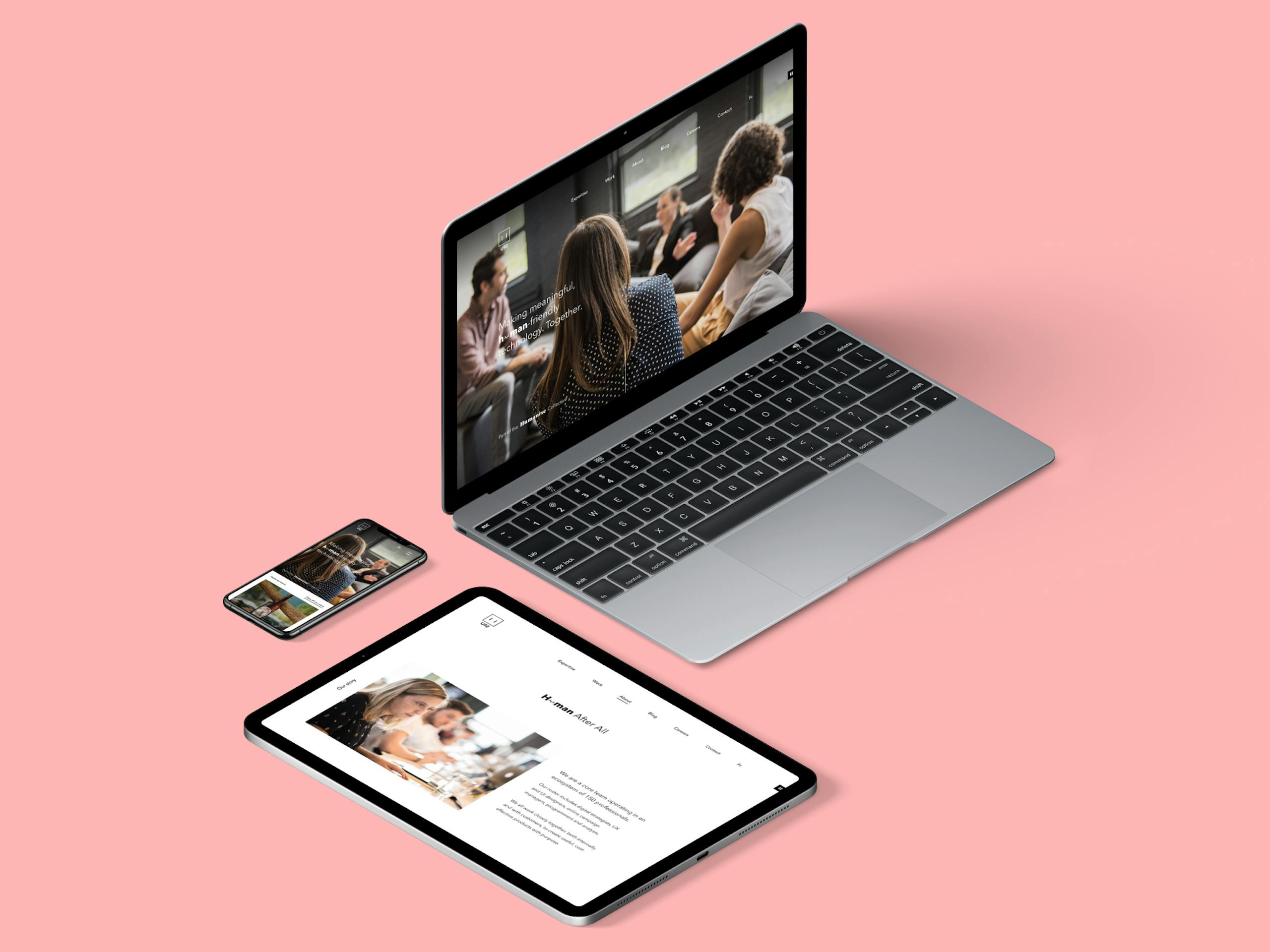
Redesign of the agency's website of the same name, during the summer of 2018. The challenge was to revamp the site to bring it up to date while taking into account the company's new vision.
About
U92 is a digital agency from Montreal, part of the Humanise collective. The team help brands establish an online presence tailored to their needs.
Project Team
Direction and strategy: Pascale Lacroix-Vézina
UI Design: Nicolas Bonte, Severine Doucet, Thaiany Moreno
Context
Following a rebranding of the agency in 2018, the website needed a complete overhaul to align with it. The new website needed to reflect U92's repositioning and new presentation strategies. In addition to a new visual, the content of the pages had to be improved with new features to generate new customers, help recruiting at the agency and offer blog posts to present leadership on the sharing of knowledge in the industry.
My role
- Design and analysis of content and functionalities
Main tasks
- Research and analysis of the content and functionality required in the redesign
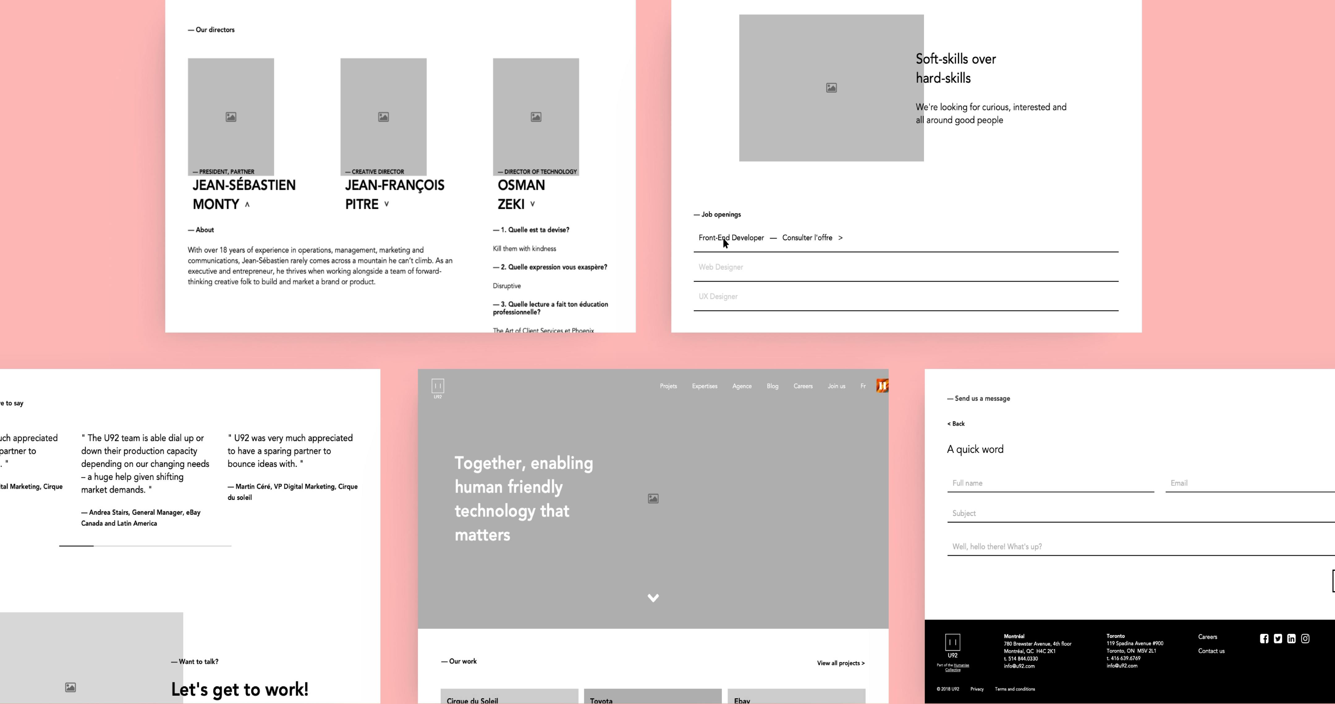
- Creation of wireframes in axure
- Documentation of functionality and technical specifications for development
- Validation workshops with the team
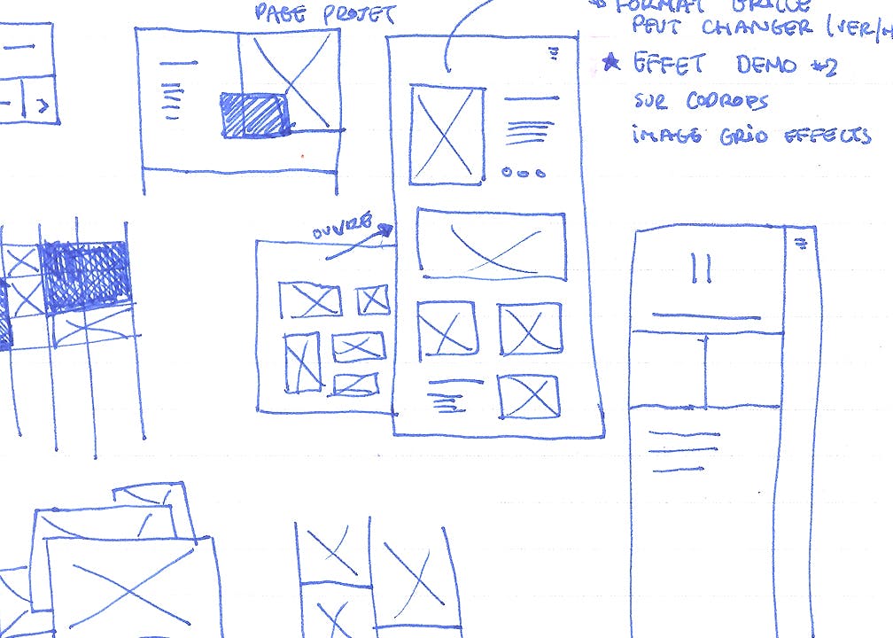
Some sketches to identify behaviors that could be used in the redesign.
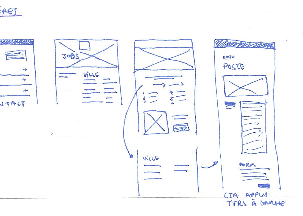
Preliminary wireframes and explorations for the desktop version.
Process
After a review of the progress made previously by the team, I organized in a summary various ways the contents and technical features requested in a new tree structure of the site.
I then proceeded to a reference search among competitors to identify the different methods used for the organization of content and specific features used in these pages.
Finally, I documented the case studies that needed to be modified and added, to upload in the new version of the site.
Challenges
Being my first solo project in user experience, this project was extremely formative, while challenging me. The learning curve was important because at the same time as I had to realize this project, I also had to build a work process and learn concretely about the business and the agency being a new intern.
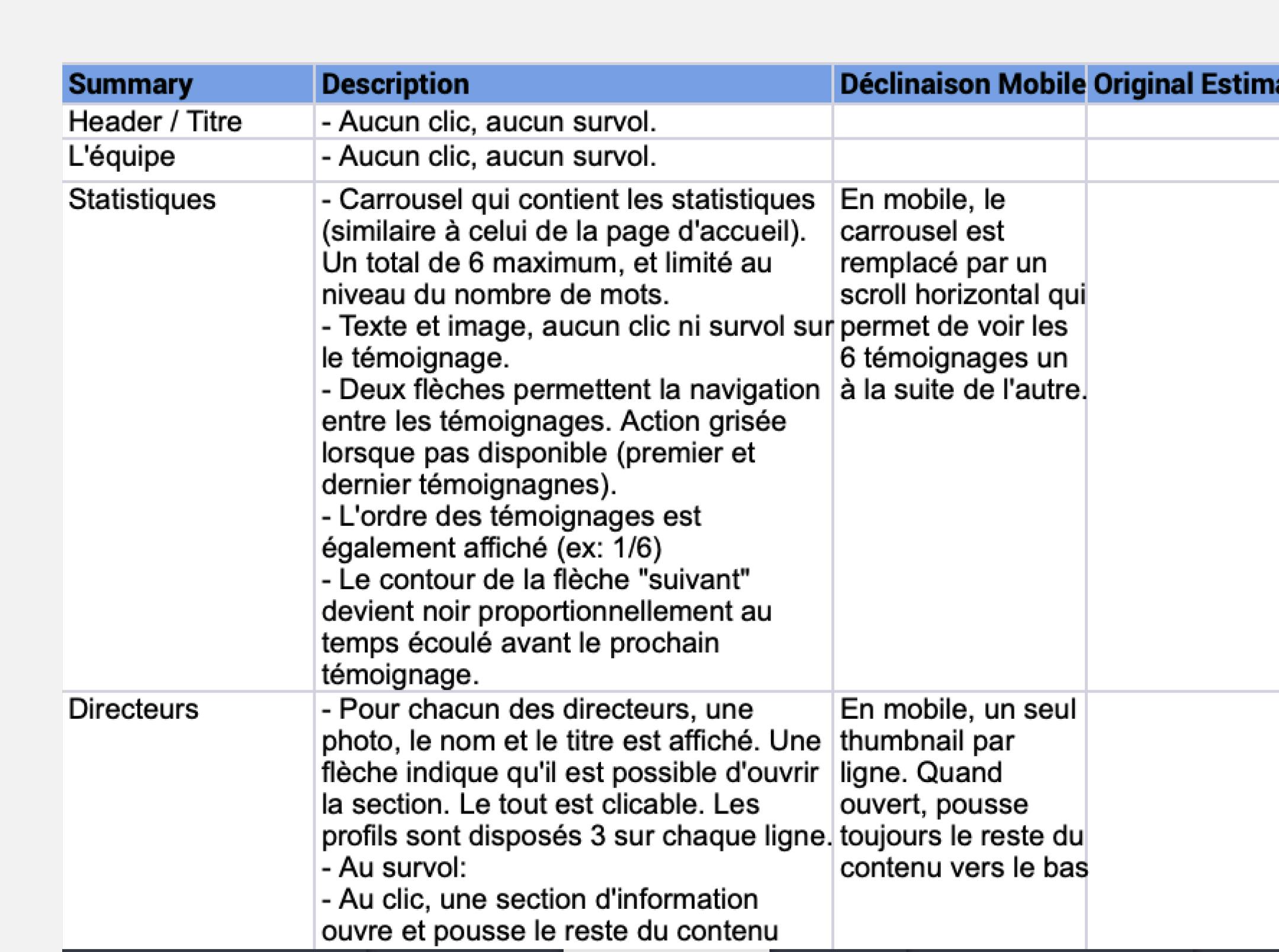
Writing of multiple technical specifications for all pages, in order to document the expected behavior.
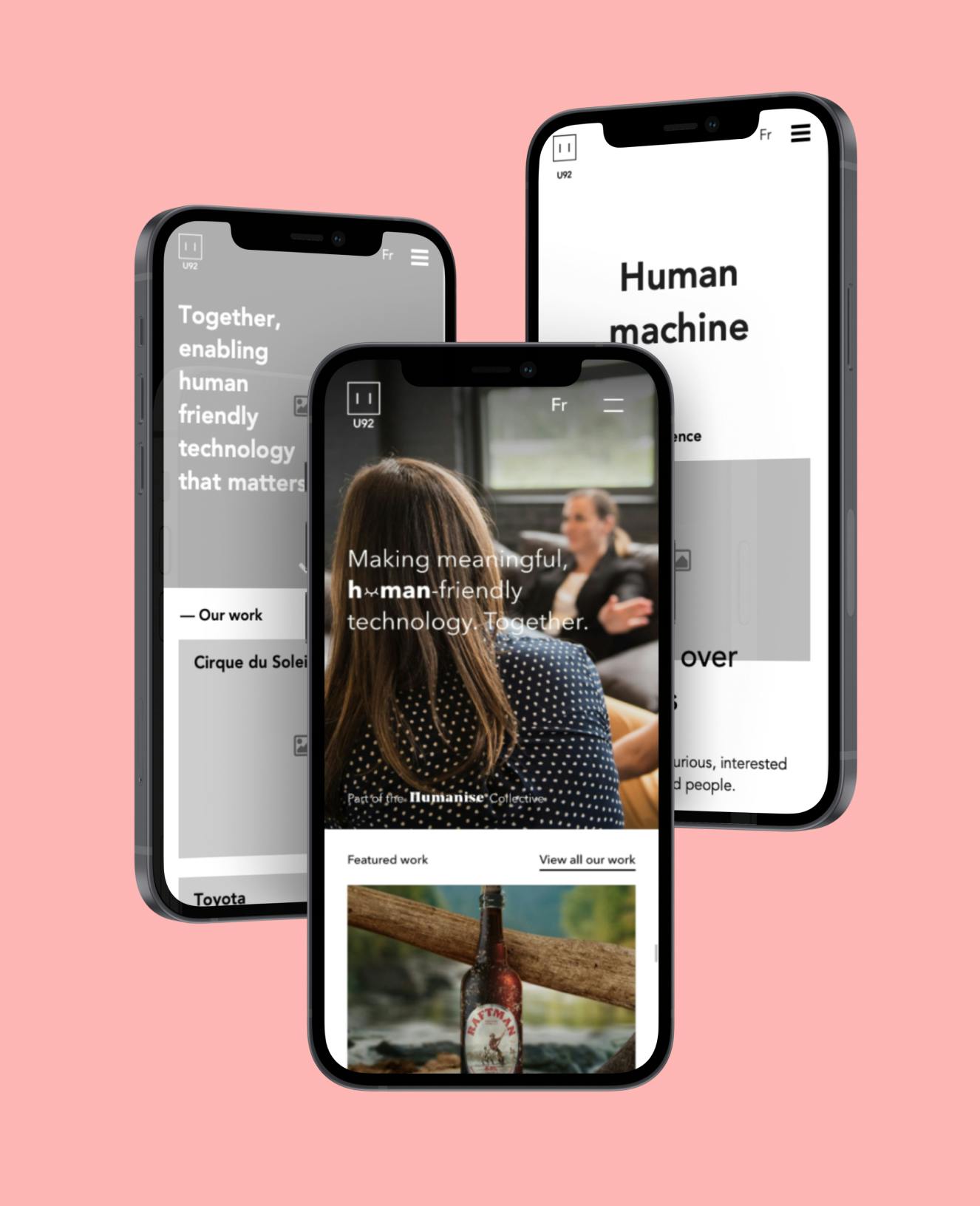
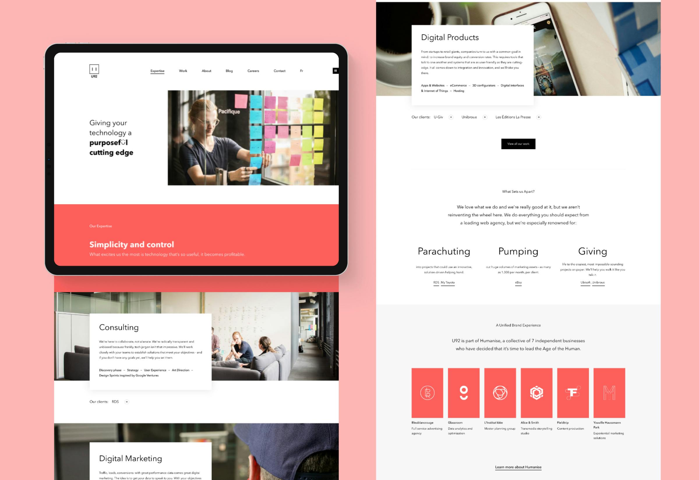
Final look
Based on the different elements documented above, I created a series of wireframes, for desktop, tablet and mobile. In these screens, I had to inspire a certain direction to take for the layout of the graphic elements. The idea was to leave a lot of room for photography, since we had the opportunity to do a complete shoot of the team. In addition, the content had to be very airy, minimalist, and with a strong typographic hierarchy that would allow for typography play. To keep the whole thing coherent, attention was paid to animations in key places.
