Trinergia
Art direction and interface design for Gestion Trinergia, a consulting firm in financial planning and security.
February 2018
ClientProject in collaboration with Zone W3 Media.
Expertises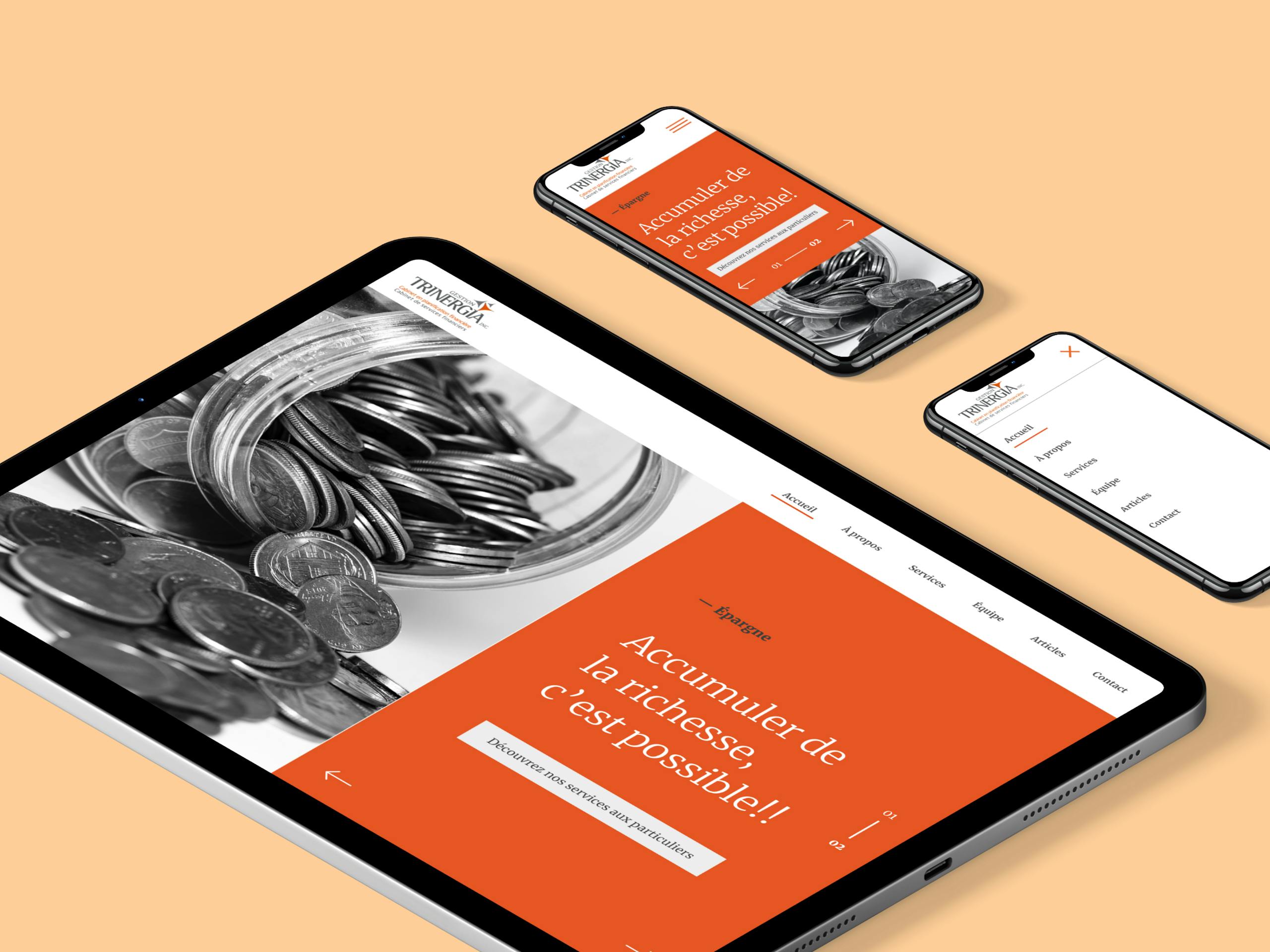
Context
I was approached by Zone W3 to redesign Trinergia digital experience. The goal was to create a timeless and minimalist interface, while keeping the initial brand image of the company and its colors.
Principal tasks
- Creation of 3 different proposals for the general artistic direction of the site
- Prepare the chosen version and declining visuals for the other pages and formats
Équipe projet
Project management : Marie-Josée Lavigne
Web director : Stéphane Bergeron
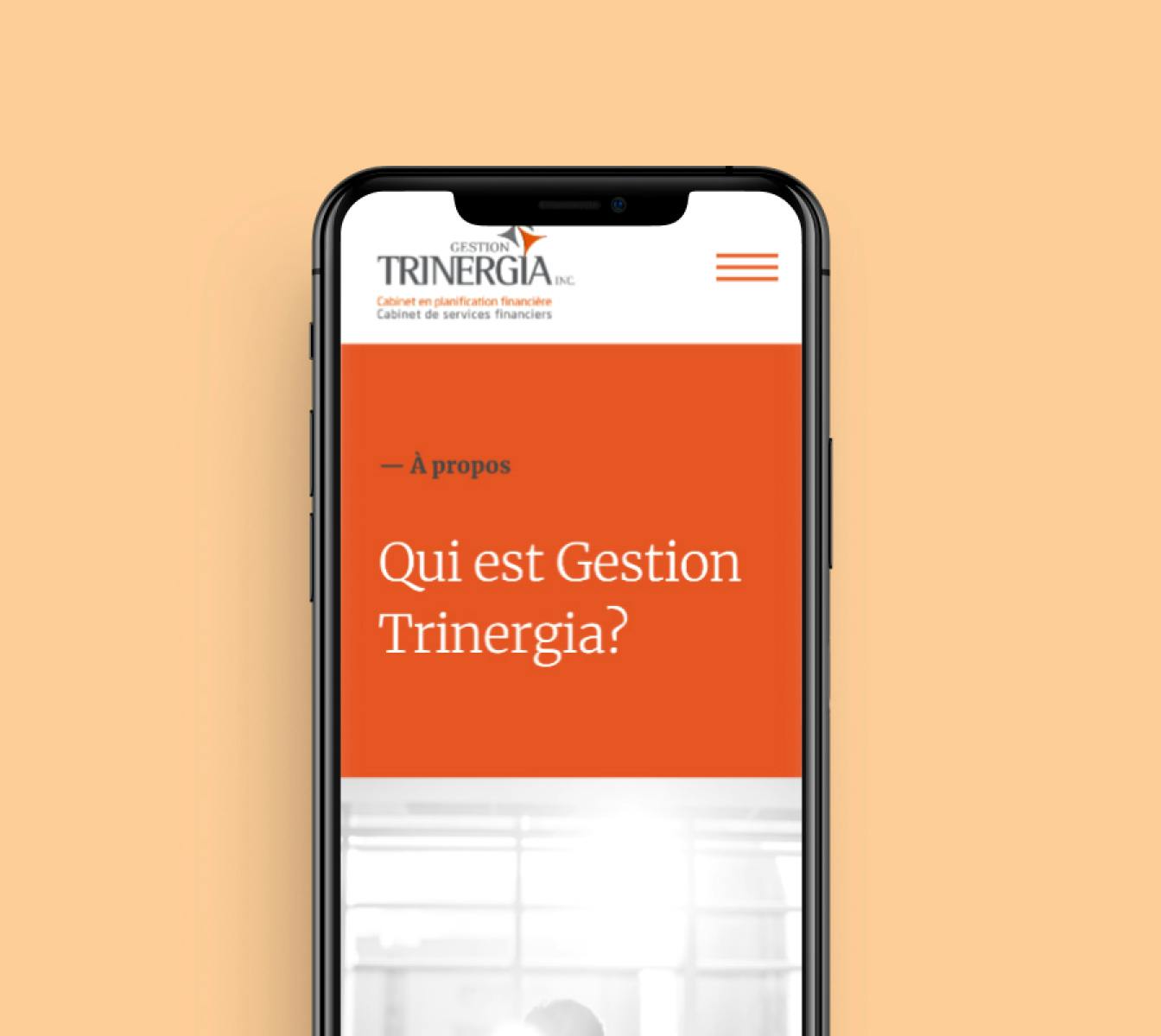
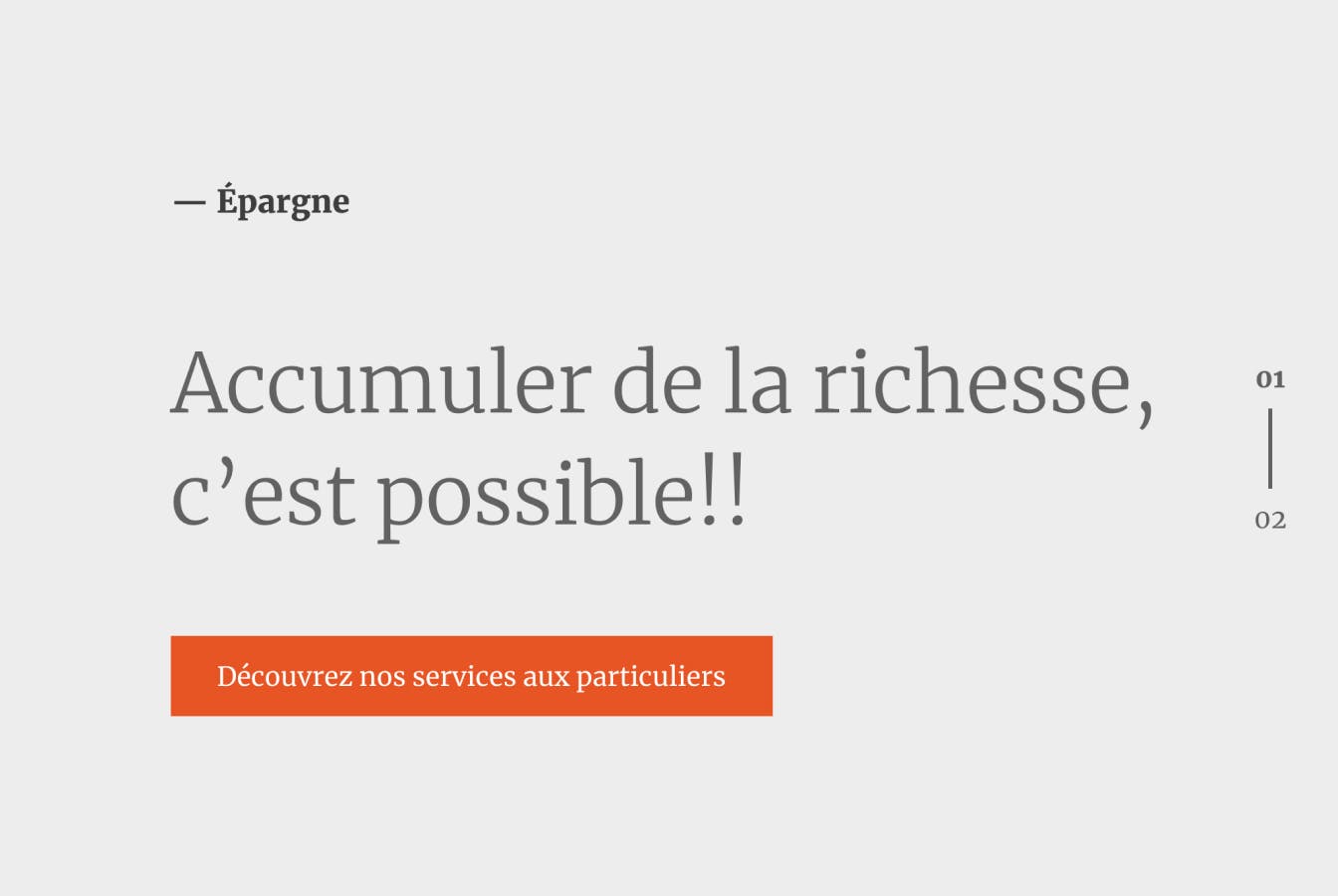
Final look
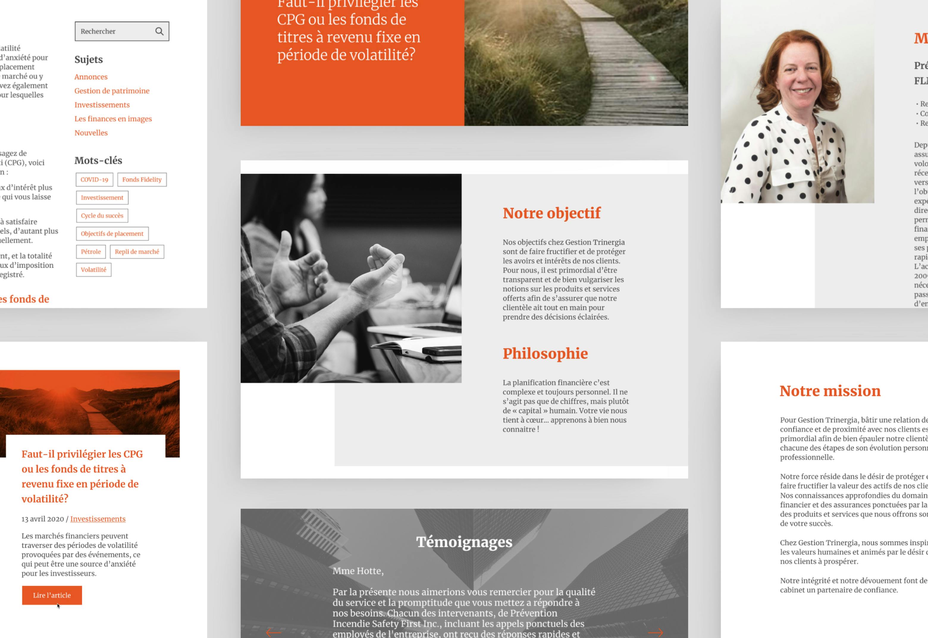
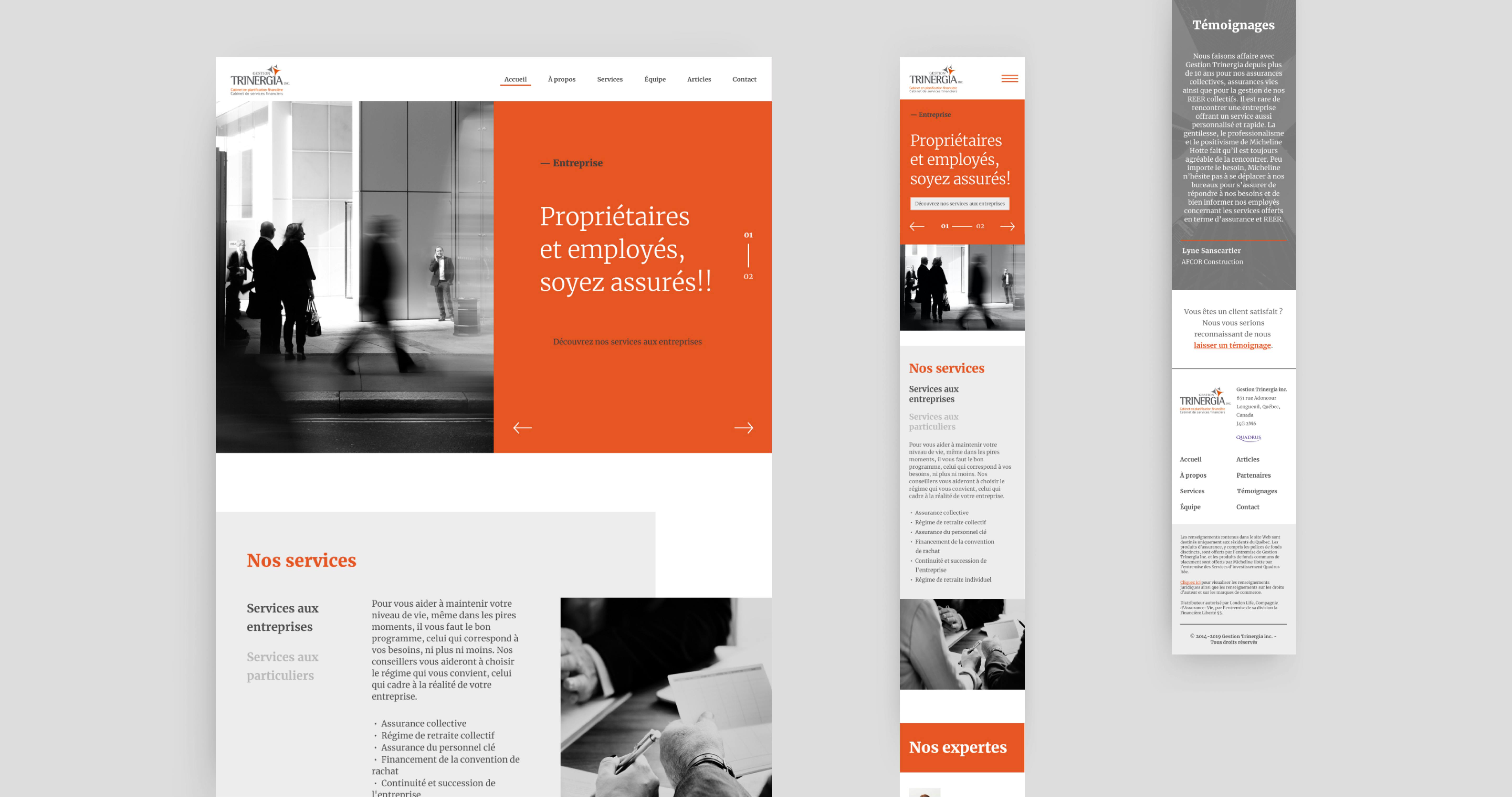
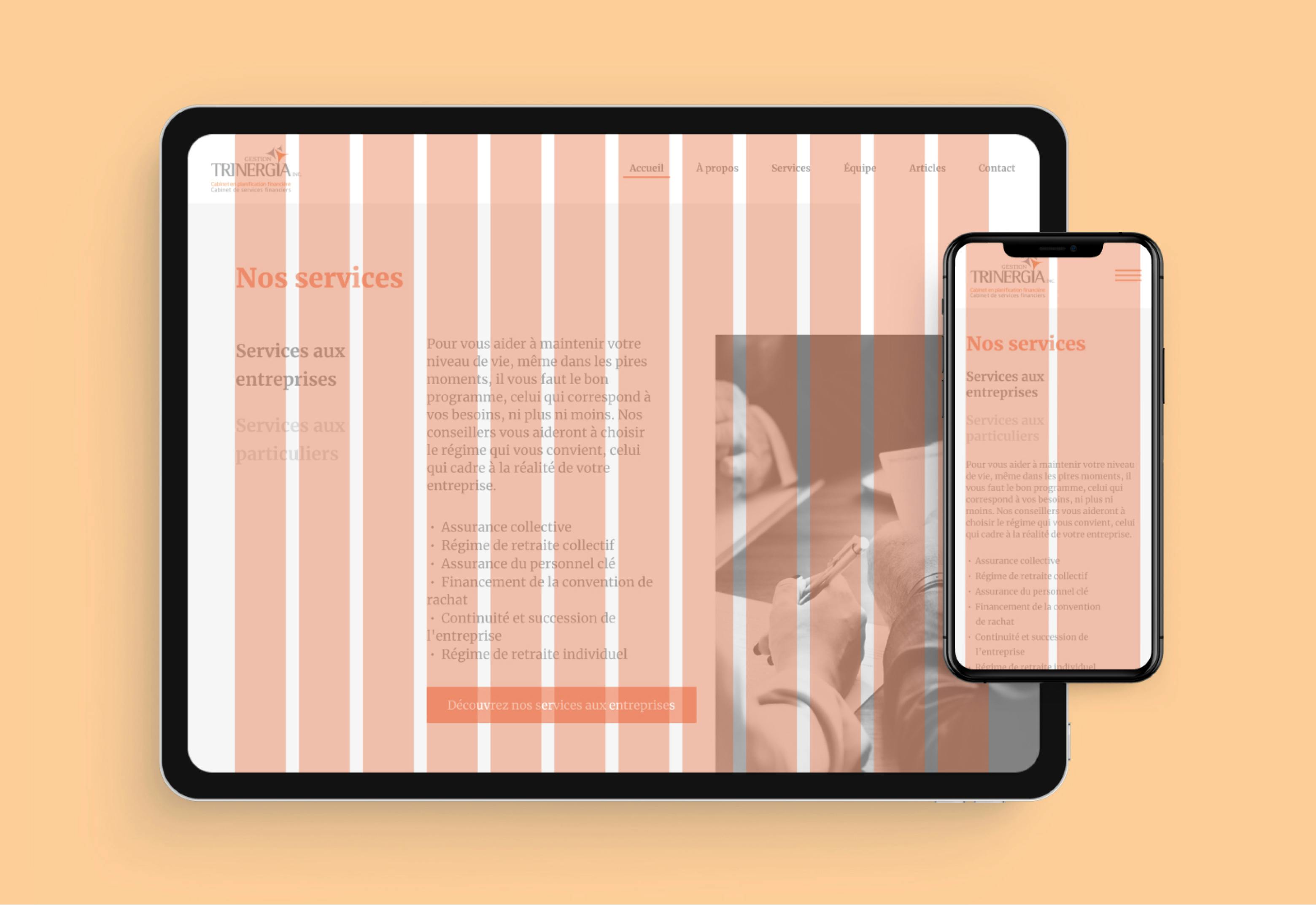
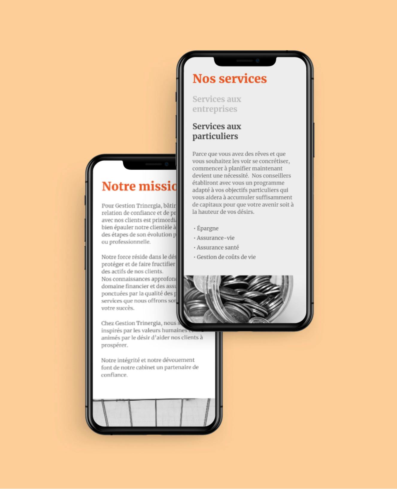
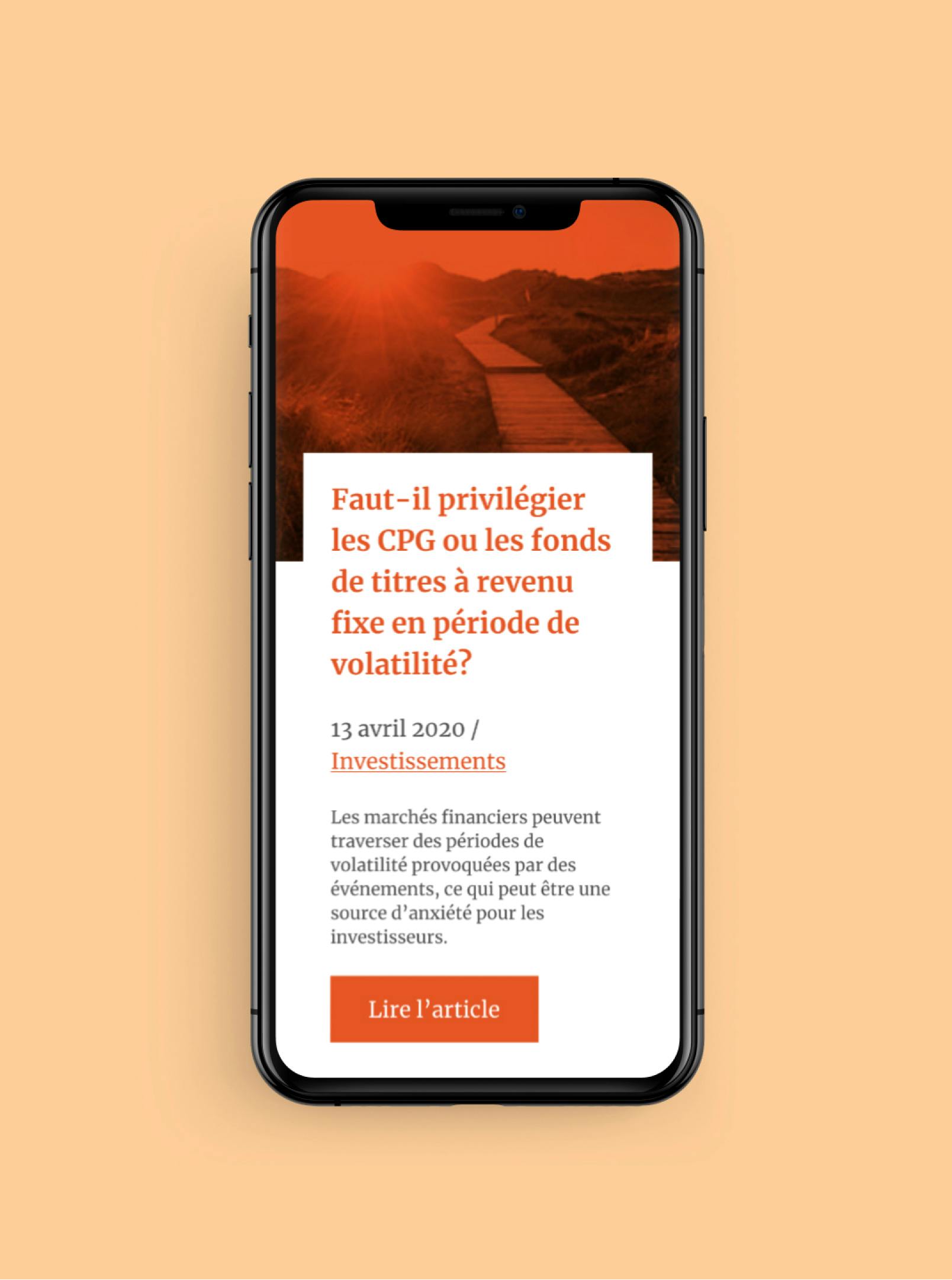
The artistic direction of the website is balanced between the gray interface, complemented by clean black and white photographs, as well as the use of Trinergia orange as a complementary visual accent. A serif typography, with square serifs, gives a little personality to the interface, as well as typographical details that enhance the visual and functionalities, both on mobile and desktop.
